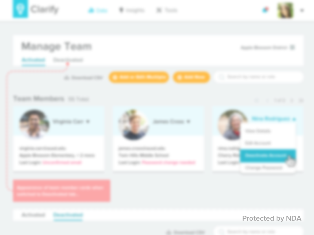
Manage Team
BrightBytes, June 2017
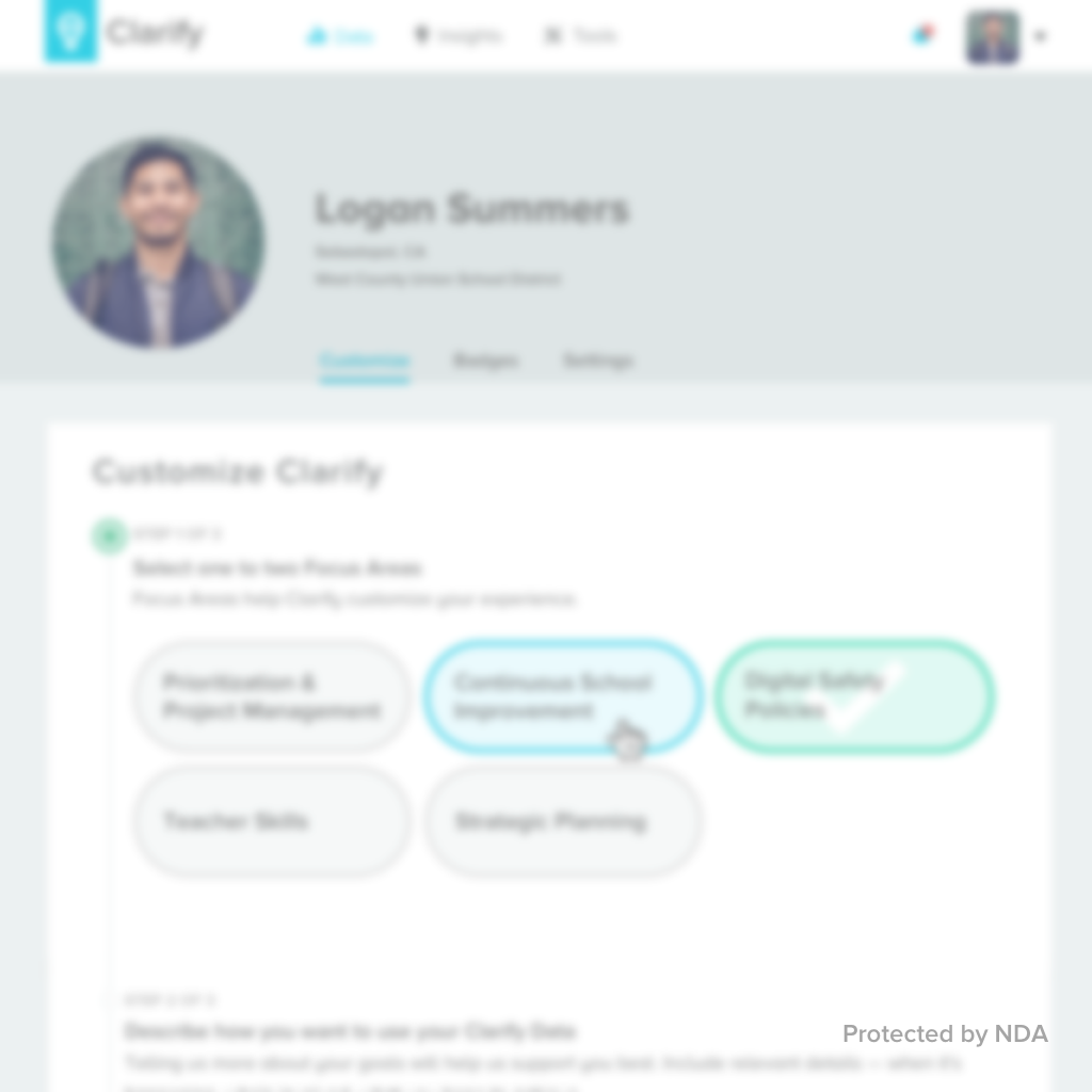
Project: service within the Clarity web platform
Contributions: user research, site architecture, layout design, wireframing
Team: UX design (me), interface design (1), product management (1), development (5)
Results: quantified the low usability and prioritized needed improvements for the next iteration
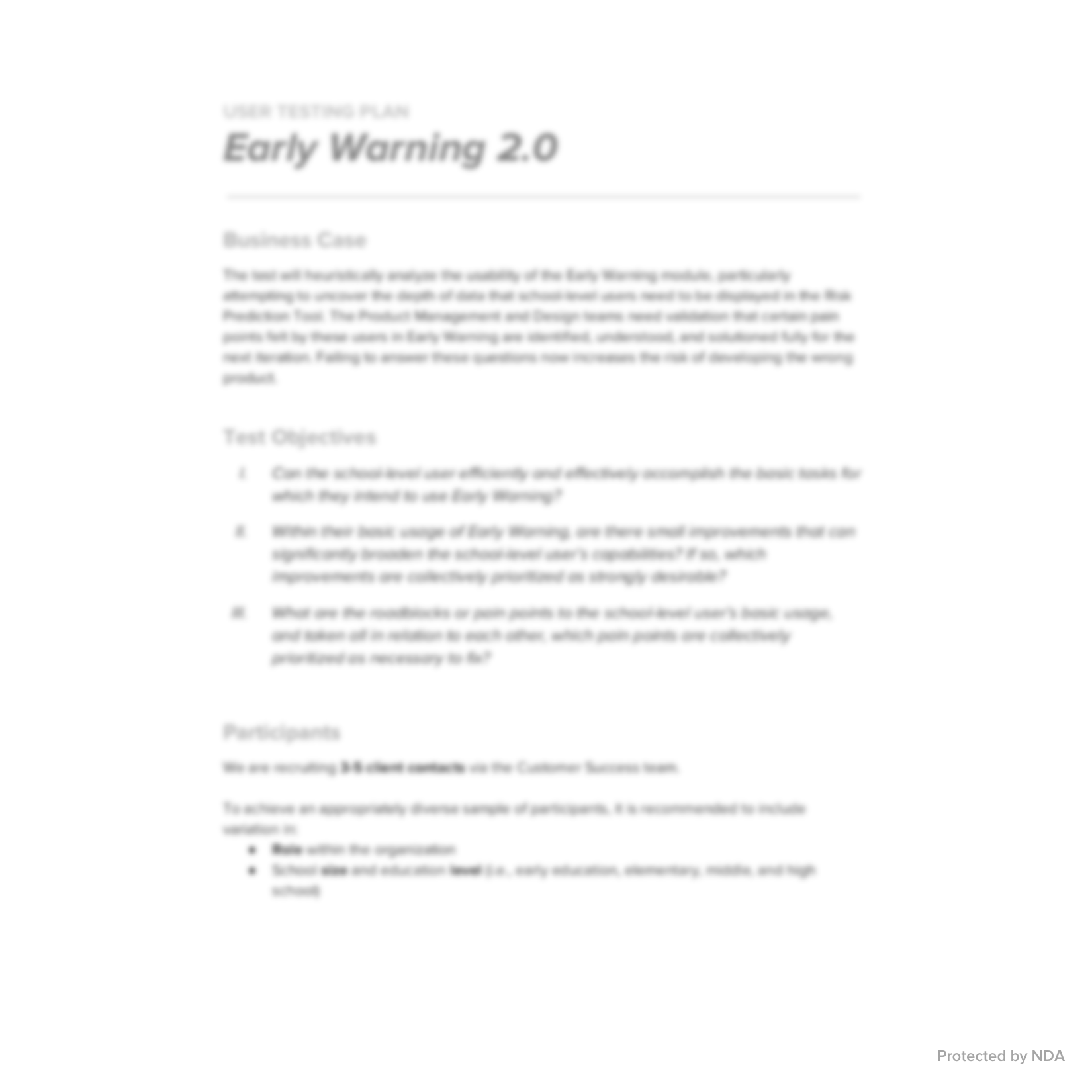
As BrightBytes increased its support of schools and districts wishing to make the Clarity platform accessible through their single sign-on (SSO) service, we recognized a need to revisit and adapt our tool for permissions management, “Manage Team.” Adding to the complexity, the privacy of student data in education systems is strictly protected (all personally identifiable information, or PII, must be secured), and it was a recognized blocker for many admin users to not be able to turn on/off access to PII for standard users they managed for their organization.
Our objectives centered around basic tasks, prioritization of pain points, and understanding the specific challenges of organizations with SSO and student PII. To achieve both qualitative and quantitative data in the remote interviews, I designed the plan and wrote a script for scenarios involving sets of tasks, followed by a card sort to prioritize the pain points. Scenario-based tasks are a common method I employ to structure what might otherwise feel like a series of rote tasks; the scenarios are simple and designed to be relatable to participants. I find that card sorting, too, is a super engaging way participants can unpack their own mental models about a site, lending rich information for future use in information architecture.
Our participant group included four users and two of our own support specialists; their lens was key to understanding a heavy usage experience of the “Manage Team” service since they troubleshoot issues around it so frequently. I moderated and lead the interviews without a hitch. After analyzing the results and preparing a presentation to share with stakeholders tasked to work on “Manage Team,” I lead a discussion around the quite low usability ranking and the repeated remarks on the over-reliance on customer success resources, advocating for us to address some of the top pain points reinforced by the findings. With the “why” understood and discussed, the product manager and his engineering squad allocated time to tackle the top three issues backed by the testing, and soon after, I began working on the UX for the redesign.
As sometimes happens, team priorities shifted; soon after wireframes were complete and while high-fidelity mocks were underway, the scope was scaled back for what could be implemented at that time. Most of the designs shown here were implemented, minus the tabs for “activated” and “deactivated” users, the organization changing functionality, the search and pagination, and the visual empty state for users without a profile photo. Additionally, the logic for access to student PII became associated at the organization level, rather than the module level, changing the new/edit user flows slightly. With the user testing backing our decisions about what we could hold off on building, we were able to ensure that needs were not ignored and benefits were left intact.
Other Projects