Custom Content Tool
UC Berkeley Extension, January - April 2018
Project: web app within the UC Berkeley Registrar’s online academic guide
Contributions: site architecture, layout design, wireframing, user interface design, visual design
Team: UX design (me +1), interface design (me +1)
Results: final course grade was an A-, and the final project review by the client and panel of experts was strongly positive
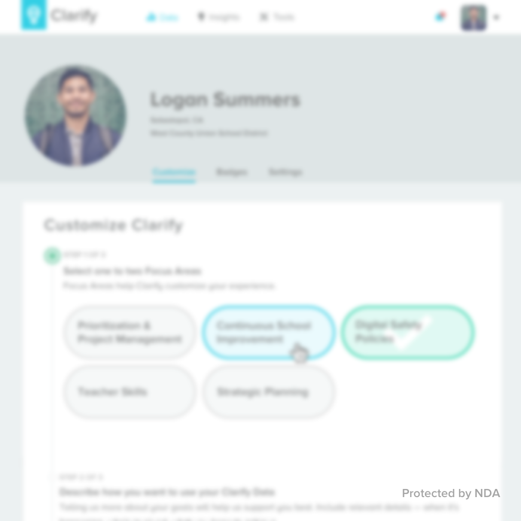
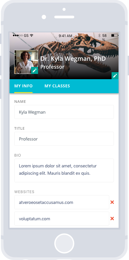
In this 10-week course, I co-designed a new mobile-first web app to allow Berkeley instructors & their proxies to publish custom content to the online academic guide, in order to inspire students to enroll. The project was created for an actual client, the UC Berkeley Associate Registrar, who I kept in touch with for feedback as designs progressed. After three introductory weeks, my work began with goal-based user definition, problem and vision statements, design goals, context scenarios, and task flows. Though I entered the course having created simple context scenarios and task flows, I gained a firmer grasp of how to make these much more useful deliverables, serving to maintain a steady connection to the user goals throughout ideation. With a partner, we pushed two core task flows forward into wireframes:
- The professor creates a profile to attract interested students.
- The professor creates a class page and notifies the proxy to further stylize and add to it.
Next, we created a visual design guideline (based on Berkeley’s brand) and built out our high-fidelity prototype. Using the user testing plan I created, my partner tested our prototype with past professors he recruited, uncovering a key finding that improved navigation. At the end, our final presentation to the client included the persona, context scenario, task flows, high-fidelity annotated wires, user testing report, and prototype. Reception was warm and quite positive from the client, and the panel of industry professionals confirmed that the designs impressed upon them a strong execution of design principles, remarking also that our visual design was a standout success. If I were to take the project forward, I might try to flex and bend the visual design a bit more, striving to deliver a little more delight that the mobile context makes possible.
Other Projects